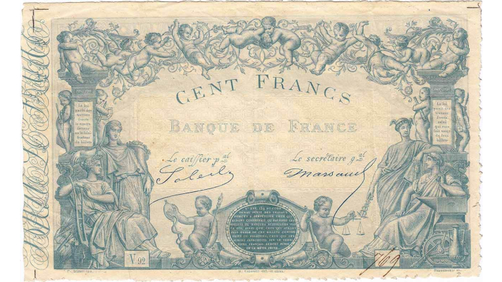
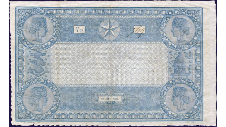
Initially printed in black, banknotes began to be tinted blue from 1862 onwards. The change was a response to the development of photography and the rising number of forgeries produced using this technique. The evolution of banknotes is mainly linked to the ongoing fight against counterfeiters; in this case the “celestial” blue ink made them harder to reproduce photographically.
This 100-franc banknote from 1862 was the first “blue” note to be put into circulation. Based on a painting by Pierre Bisset, which was redesigned to fit the format by Cabasson, the front of the banknote depicts Mercury and Industry on the right, and Abundance and Agriculture on the left. Around the central medallion, two children symbolise Truth and Justice. The upper part is decorated with a “garland of putti” (naked boys representing Love). The images on the banknote were still heavily inspired by mythology, with themes relating to balance and justice featuring alongside figures embodying trade and production. With banknotes becoming more widespread during the Second Empire, their iconography was intended to inspire confidence.
On the reverse, the design (whose minute detail made it very difficult to copy – another defence against counterfeiters) consists of four medallions bearing the profile of a woman. On the left, a fish winds itself around an anchor to symbolise the Banque de France’s motto, “La Sagesse fixe la Fortune” (“Wisdom disciplines Fortune”), while on the right a beehive and swarm of bees symbolise industriousness and savings.
In 1888, the discovery of near-perfect forgeries of the 1863-type “blue” 500-franc note led the Banque de France to abandon its blue ink in favour of a two-colour design in pink and blue.
Mise à jour le 1 Septembre 2025

