- Home
- Publications and statistics
- Publications
- Consumption inequality in the digital ag...
Post n°267. Rich households consume digital goods more intensively than poor households. As digitalisation makes some goods and services cheaper, higher-income households benefit more. Using US household data, this blog argues that the relative price effect of digitalisation is sizeable and amplifies the effects that digitalisation has on income inequality.

There is a heated debate over how far digitalisation increases economic inequality. A substantial amount of evidence has emerged over the last decade indicating that digitalisation fuels income inequality: digital technology administered by high-skill workers can replace low-skill routine work. For a welfare analysis, however, one must not only consider income, but consumption and employment as a whole. This blog argues that there exists another important effect of digitalisation on inequality, next to income. Namely a relative price effect that changes the affordability of the consumption baskets of different income deciles.
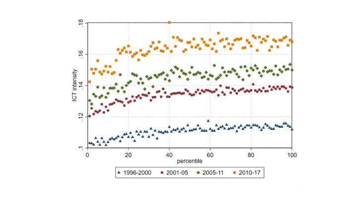
We provide evidence from the United States that the share of digital technology in the overall consumption basket is higher the richer a household is. Our approach is to measure the digital content of all consumption goods and services by considering how much digital capital is used in the production process. With this, every consumption category has a certain digital share – a high digital share indicates that it originates from an industry that uses a lot of digital capital, or that it includes inputs from digital-intensive industries. Using information from the consumption expenditure survey, we can then construct the information and communication technology (ICT) share of consumption baskets along the income distribution; see Chart 1. The richer a household is (the larger the income decile on the x-axis) the higher the ICT intensity of the associated consumption basket. Rich households consume more goods and services that rely on digital technology in the production process. There is a significant difference between the poorest 40% and the rest of the population. ICT intensity flattens for the rich and the middle-class (top 60%). For example, in the latest observation period, the poorest 20% have an average ICT intensity of 15% while the top 50 have an average ICT intensity of 17%, which is 2 percentage points higher. Next, we explore which categories are driving these differences; we then demonstrate that these differences can have substantial welfare implications.
Drivers of consumption inequality
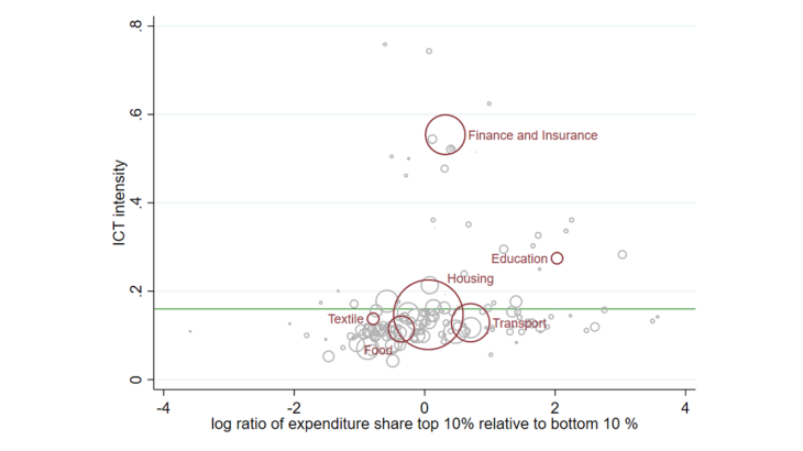
Which consumption categories drive the difference between the poorest households and the rest of the population? With our novel dataset, we can dive deeper into the issue. Chart 2 shows the ICT intensity of all consumption categories. The size of the circle for each category indicates its importance in terms of expenditure share for the median household. The x-axis shows the log ratio of expenditure for each category for the top 10% relative to the bottom 10%. This means that the more we move to the right of the graph, the more important a category is for rich households in relative terms. Further to the left are goods and services that poor households spend a larger fraction of their expenditure on.

There are almost no categories with an ICT intensity above the average of 16% (the horizontal green line) on the left half of the graph. This is the region that is relevant for the poorest households. On the upper right part of the graph, there are many categories with relatively large ICT intensities. Most prominently, richer households spend a larger share of their expenditure on education or finance and insurance. Both categories originate from sectors that use a lot of digital technology. The finding of higher ICT intensities for richer households also holds when finance and insurance or education are removed, as the goods and services that are important for the poor (bottom left of the graph) have very low ICT intensities. This means that only a small amount of digital technology is used in the production process for these goods – for example, food or textiles. If the production process for goods and services is similar in other countries, the finding of higher ICT shares for richer households might also apply there. However, more research is needed to confirm this.
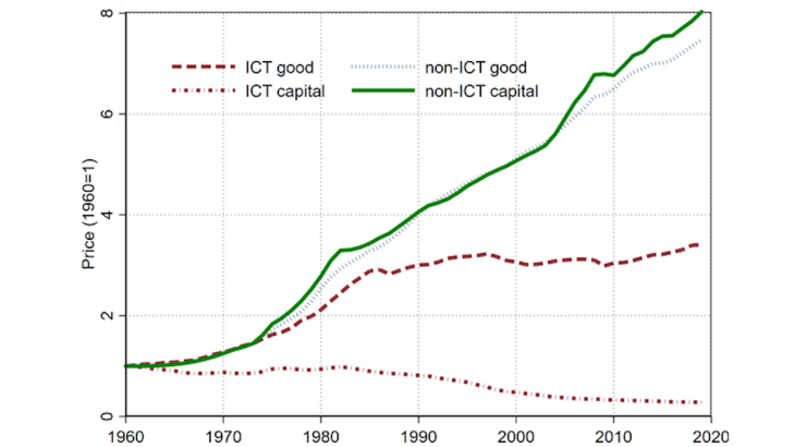
The crucial driver that makes ICT broadly applicable is the price decline for ICT capital over the last decades. This decline of relative prices for ICT capital has led to a broadening of its use. Certain industries have benefited from this trend, with the result that the relative price of their products has declined.

In this graph, we cluster all the industries in our dataset, sorting them into ICT-intensive and non-ICT intensive industries. Goods prices in the non-ICT intensive sector have risen in line with the average prices of capital inputs that we classify as non-ICT capital, see both green lines. In contrast, the relative price of ICT capital has declined strongly. This coincides with a substantially lower price increase for goods from ICT-intensive industries (dashed red line). The data on prices are taken from NIPA.
Richer households consume ICT-intensive goods more heavily and the relative price of ICT-intensive goods has declined. Taken together, this implies that the price effect of digitalisation benefits rich households more than poor ones. How important is that effect? It is possible to make a back-of-the-envelope calculation by considering the overall price change for 1996-2017 of all goods categories and combining this with nominal expenditures along the income distribution. In such a calculation, Arvai and Mann (2021) show that the price increase for the top 20% of households is worth around 25% of their 1996 income while the price increase for the poorest 20% is worth more than 50% of their income. This descriptive analysis alone is not enough to establish a causal link between digitalisation and goods prices. A structural model that directly establishes the link between digitalisation and the price decline in ICT-intensive goods and assets can help: using the information in Charts 1 and 3, Arvai and Mann (2021) conduct a counterfactual analysis in a model with two goods. They match the decline in the relative prices of ICT assets and goods with a permanent digitalisation shock. This shock makes the transformation of output into ICT capital easier and replicates the divergence in relative prices between ICT assets and ICT goods in Chart 3. Using this shock from the data, the model is calibrated to match the relative price decline of ICT-intensive goods to non-ICT intensive goods and the increase in the wage skill premium. Arvai and Mann (2021) estimate that 22.5% of the increase in consumption inequality between rich and poor households that is caused by digitalisation can be attributed to the decline in relative prices. The price effect therefore has sizeable implications, and looking at income inequality alone understates the overall effect of digitalisation on inequality.
Updated on the 25th of July 2024